
Data visualization: the unsung hero of executive decision-making. A powerful tool that turns complex data into digestible insights. Yet, it's no secret that creating effective visualizations can be a challenging endeavor.
Today, we'll deep-dive into ten common mistakes in data visualization and more importantly, how to avoid them. So let's dive right in, shall we?
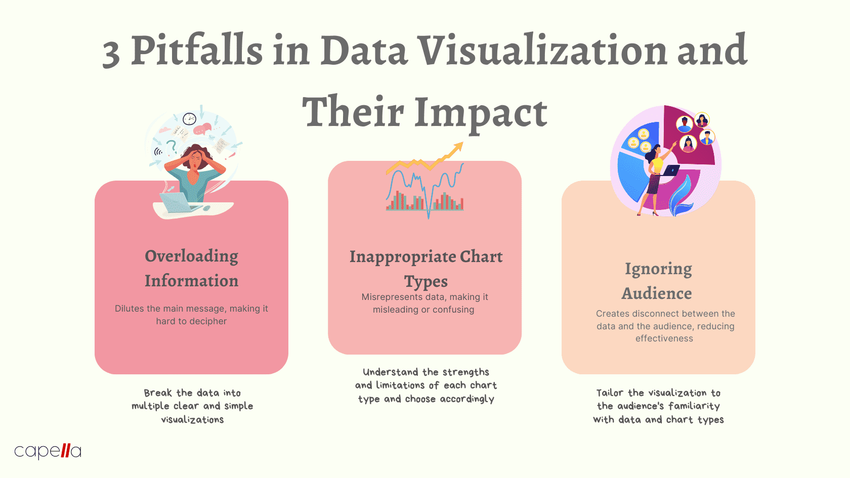
1. Overloading Information
"The first step towards sophistication is simplicity."
It's tempting to squeeze as much information as possible into a single chart or graph. But, paradoxically, this often obfuscates the message rather than illuminating it.
Consider the following scenario: A sales executive presents a line chart with five different product sales trends over the past five years, all color-coded. The CEO squints at the confusing tangle of lines, wondering if they need to get their eyes tested. The message is lost in the visual noise.
The Solution? Embrace simplicity. Break down the data into multiple visualizations if needed. Prioritize clarity over quantity. A series of clean, simple graphs will tell a story more effectively than a single overloaded one.
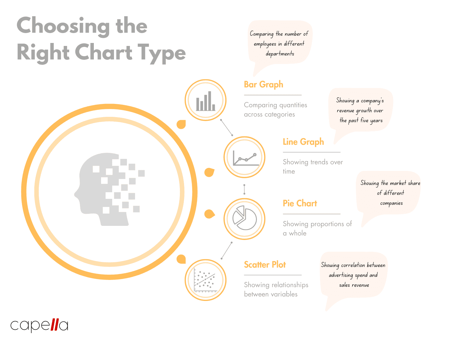
2. Using Inappropriate Chart Types
"The right tool for the right job."
Pie charts, bar graphs, scatter plots – each chart type has its strengths and weaknesses. Using the wrong one can lead to misleading or confusing visuals.
For example, a pie chart might seem like a good way to compare the number of employees in different departments. But with many departments, the differences become hard to discern.
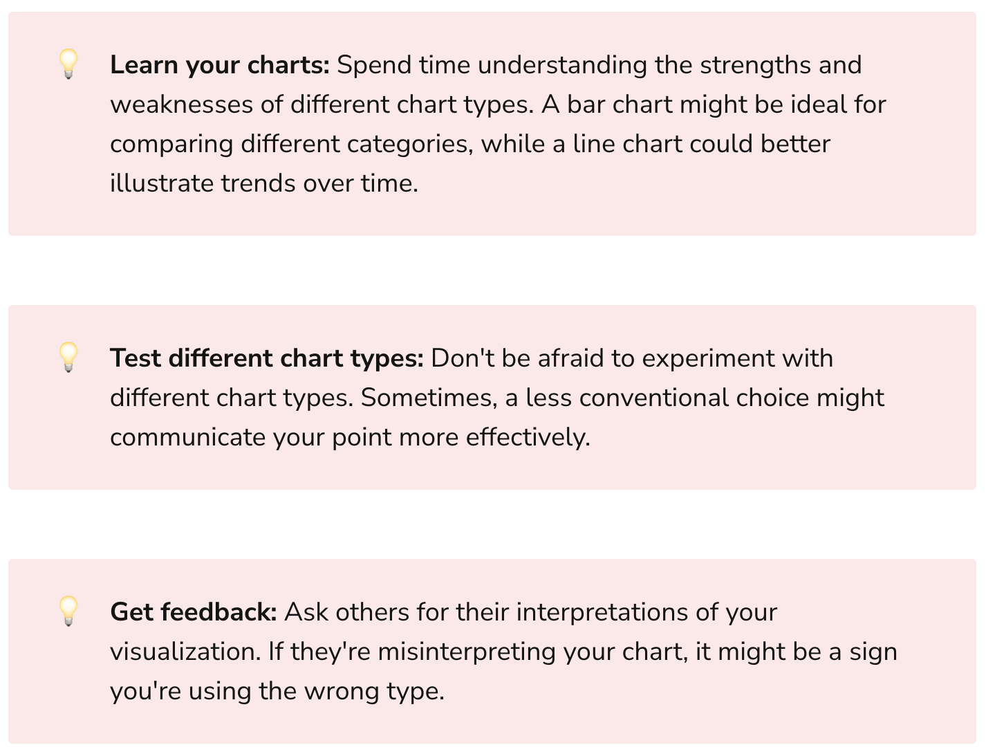
The Solution? Understand the strengths and limitations of each chart type. In our example, a bar graph would serve better to compare the number of employees across departments.
3. Neglecting the Audience
"Know thy audience."
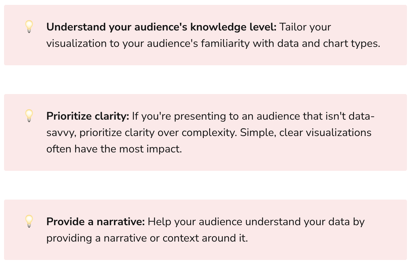
Data visualizations should be tailored to the audience's knowledge and needs. An engineering team might appreciate detailed scatter plots with regression lines, while a board of directors might prefer a simple bar chart with clear takeaways.
The Solution? Consider your audience's familiarity with data visualization types and their information needs. Simplify and clarify as necessary.
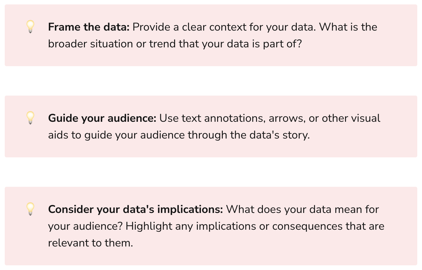
4. Ignoring the Data's Story
"Every dataset has a story to tell."
Data visualization is as much about storytelling as it is about statistics. A common mistake is to present data without context or narrative, making it difficult for viewers to draw meaningful conclusions.
The Solution? Use visuals to tell a story. Frame the data within a larger context and guide the viewer towards insights.
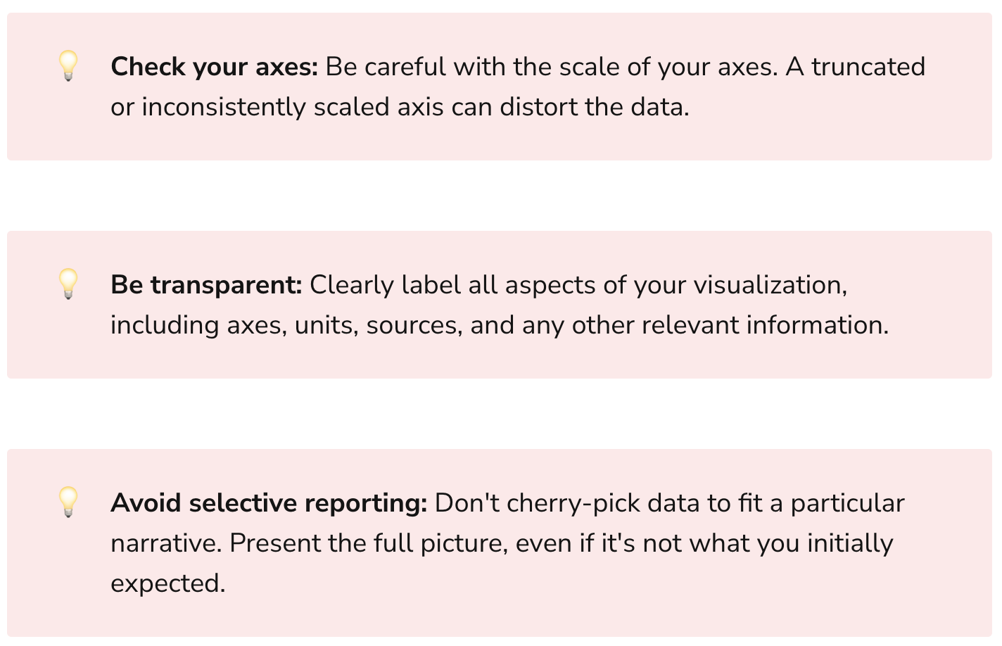
5. Misrepresenting the Data
"Integrity is the essence of everything successful."
Whether intentional or not, it's easy to misrepresent data. A common example is using a truncated y-axis to exaggerate differences. This can lead to misleading conclusions and damage credibility.
The Solution? Be transparent and honest in your data representation. Avoid manipulation that could lead to misinterpretation.
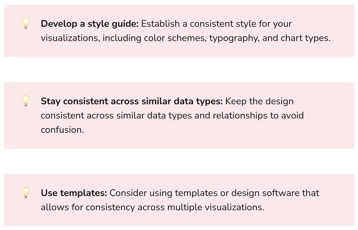
6. Inconsistent Design Choices
"You cannot be a winner without maturity and consistency."
Inconsistencies in design – like changing color schemes or scales between similar visualizations – can confuse the viewer and obscure the message.
The Solution? Create a consistent design language. Use the same colors, scales, and formats for similar data types and relationships.
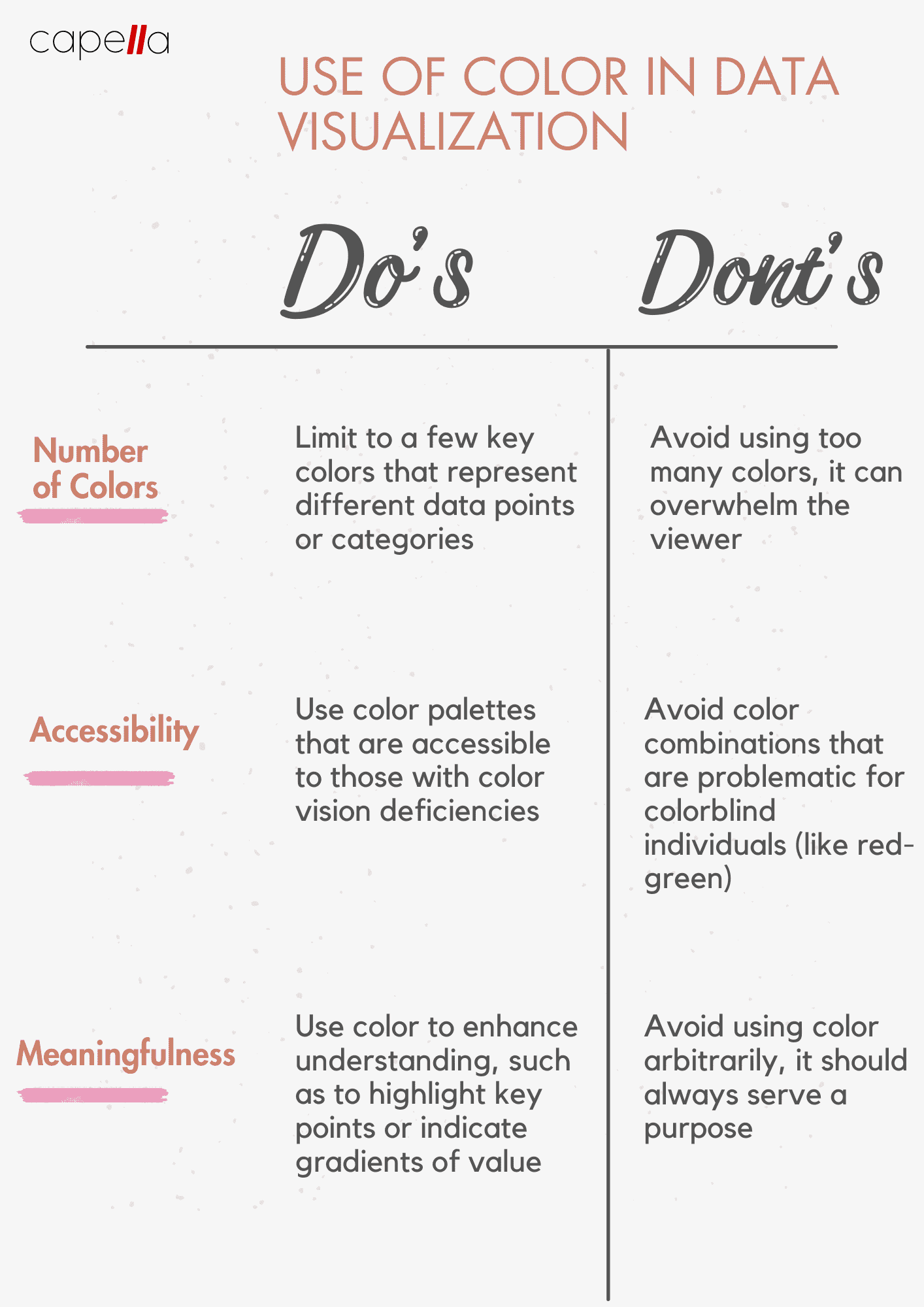
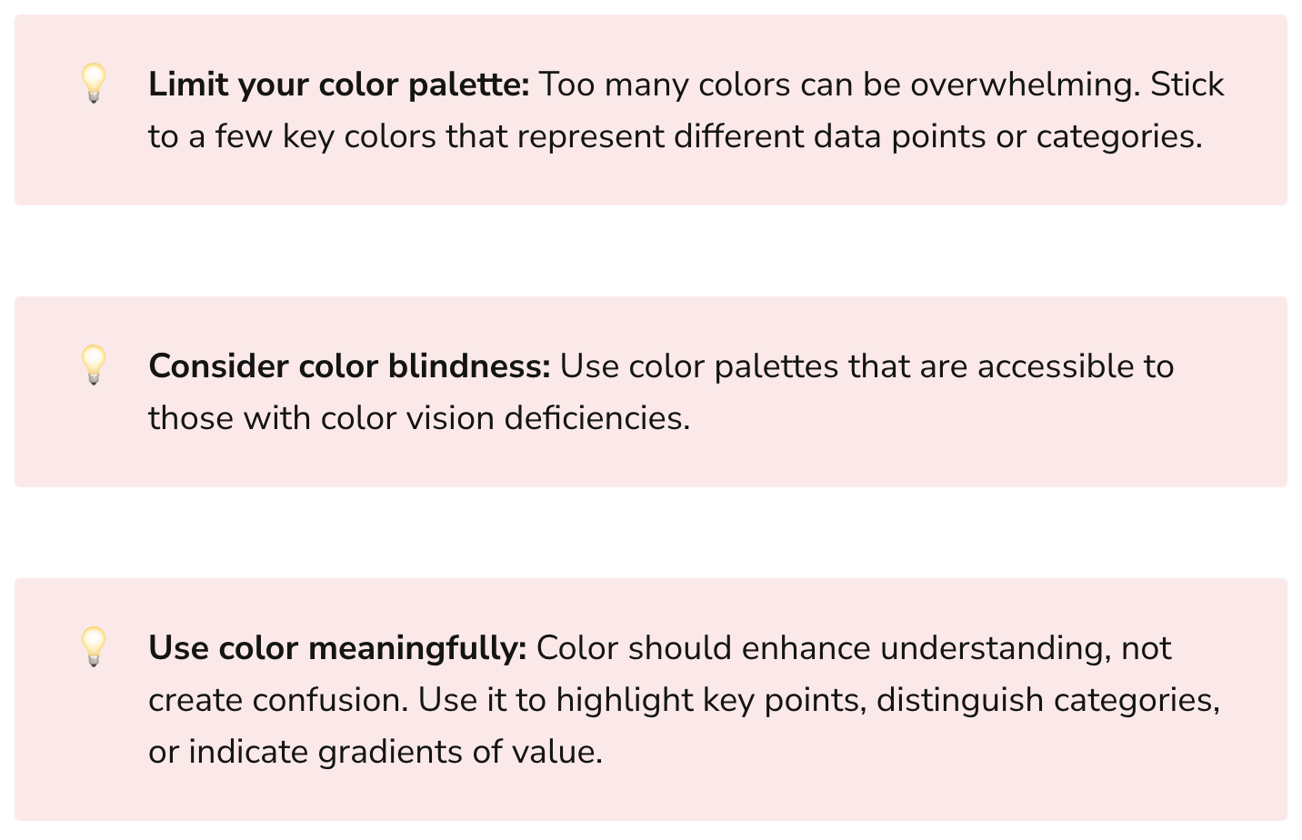
7. Poor Use of Color
"With great power comes great responsibility."
Color is a powerful tool in data visualization, but it's often misused. Too many colors can confuse, and poor color choices can make a graph unreadable.
The Solution? Use color sparingly and purposefully. Ensure your color choices enhance understanding, not hinder it. And always consider accessibility – not everyone sees color the same way.
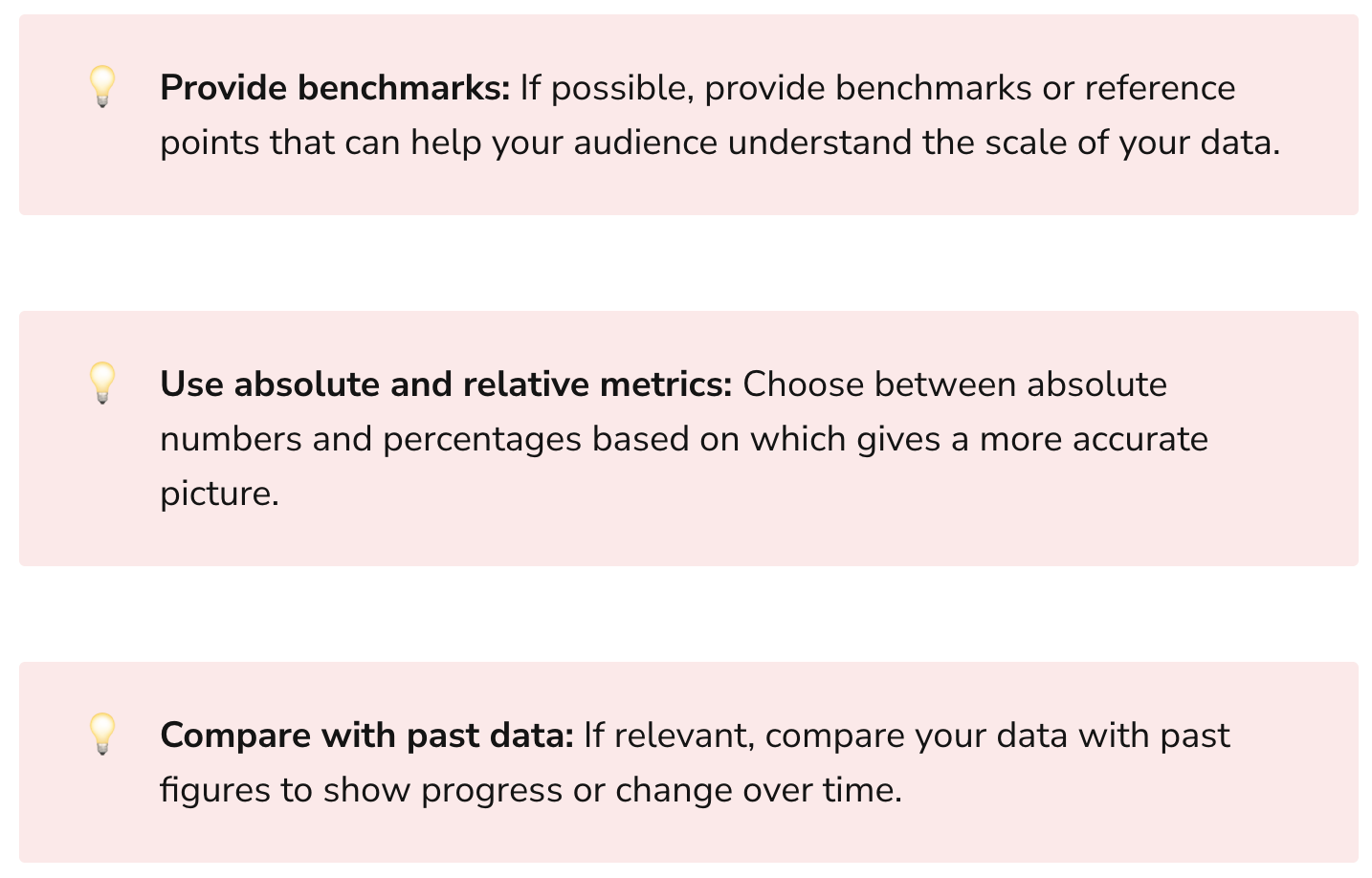
8. Lack of Contextual References
"Context is king."
Without context, it's difficult for viewers to understand the significance of the data. For example, saying a company's revenue grew by $1 million might seem impressive, but not if the company is Amazon!
The Solution? Provide reference points or benchmarks to give context. In the above example, expressing revenue growth as a percentage would provide a more accurate picture.
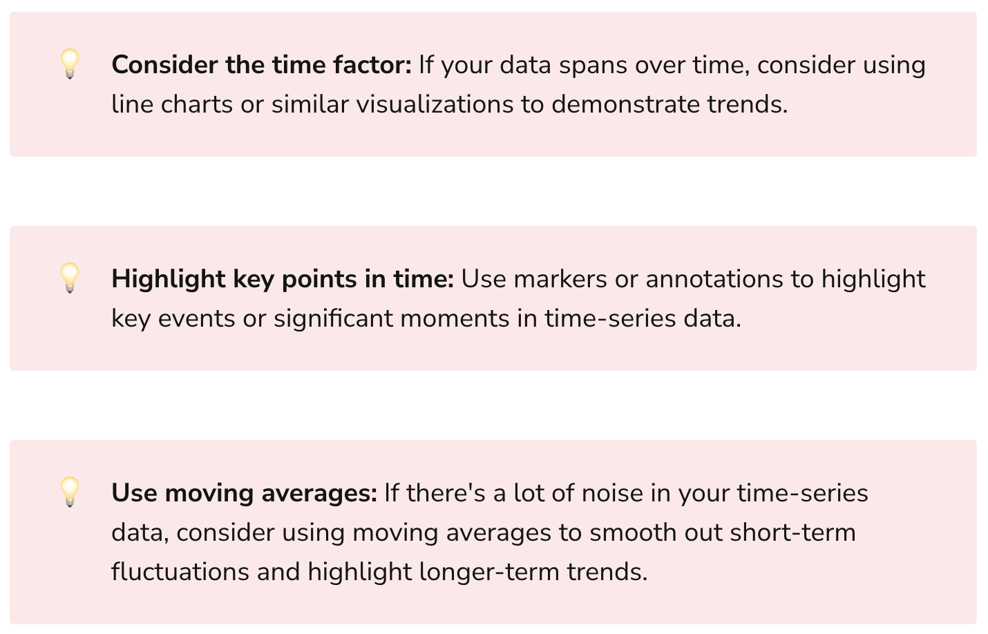
9. Ignoring Time-Series Data
"Time is of the essence."
Time-series data can provide critical insights, but it's often overlooked. Ignoring the time aspect can lead to misconstrued trends and patterns.
The Solution? Whenever relevant, include time-series analysis. Trends over time can tell a compelling story.
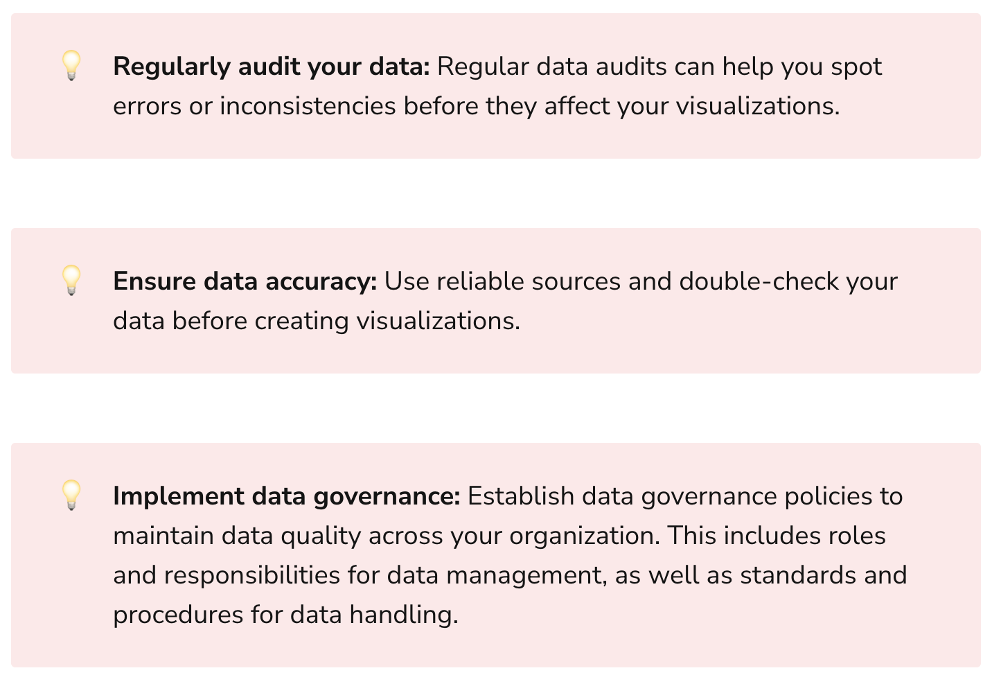
10. Overlooking Data Quality
"Garbage in, garbage out."
No matter how well-crafted your visualizations are, they're only as good as the data they're based on. If the underlying data is inaccurate or incomplete, your visualizations will be too.
The Solution? Regularly audit and clean your data. Implement systems to ensure data integrity.
Final Thoughts
Navigating the sea of data visualization can be a challenging endeavor. But with the right tools and techniques, you can avoid these common pitfalls and create compelling, effective visualizations.
Remember, the goal of data visualization is to illuminate, not obfuscate. Keep it simple, relevant, and honest. Your audience, whether they are tech-savvy analysts or top-level executives, will thank you.
After all, in the world of data, clarity is king.
In the spirit of continuous learning and improvement, let's make these missteps stepping stones towards mastery in data visualization. Keep refining, keep iterating, and most importantly, keep visualizing!

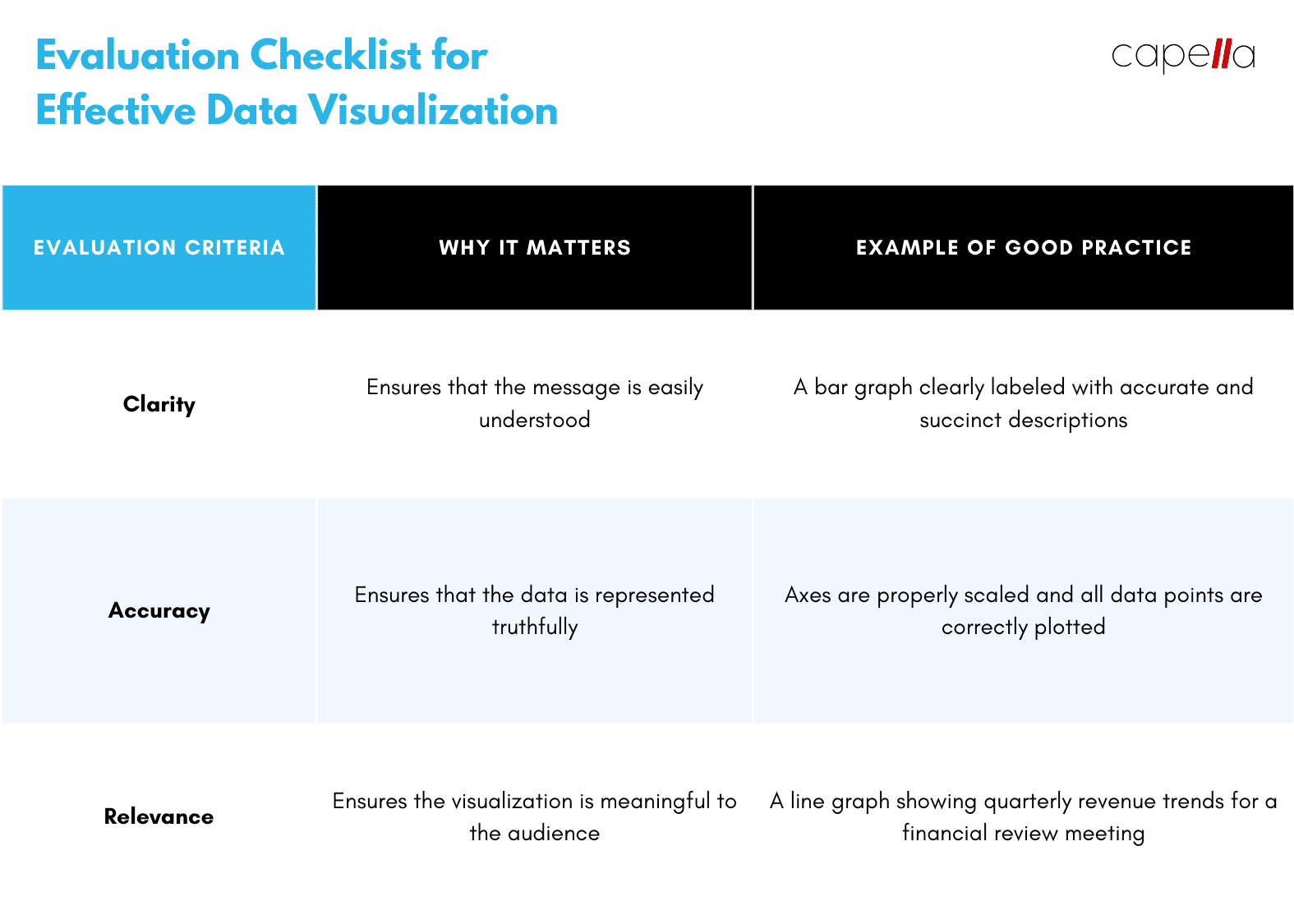
Q: What makes a data visualization "good"?
A: A good data visualization is one that effectively communicates the intended message in a clear, accurate, and engaging way. It should be tailored to the audience's familiarity with data and chart types. It should also be designed in a way that highlights the key points and avoids common pitfalls such as overloading information or misrepresenting the data. In short, a good data visualization tells a story with the data, guiding the viewer to understand complex data points with ease.
Q: How can I choose the most appropriate chart type for my data?
A: The choice of chart type depends on the nature of your data and the message you want to convey. For instance, line graphs are ideal for showing trends over time, while bar charts are useful for comparing quantities across different categories. It's important to understand the strengths and weaknesses of different chart types. Don't be afraid to experiment and always seek feedback from others to ensure your chart is effectively communicating its intended message.
Q: How can I make my data visualization more engaging for my audience?
A: There are several ways to make your data visualizations more engaging. Firstly, understand your audience's knowledge level and tailor your visualization accordingly. Secondly, use a narrative or context to help your audience connect with the data. Thirdly, use design elements like color and typography to make your visualization aesthetically pleasing. Lastly, consider using interactive tools that allow your audience to explore the data at their own pace.
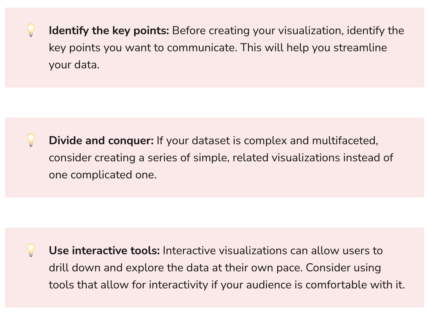
Q: How can I avoid overloading information in my data visualization?
A: Overloading information in a data visualization can confuse your audience and dilute your message. To avoid this, identify the key points you want to communicate before you start designing your visualization. If your dataset is complex, consider creating a series of simple, related visualizations instead of one complicated one. Using interactive tools can also help, as they allow users to drill down and explore the data at their own pace.
Q: Why is it important to provide context in data visualization?
A: Context helps your audience understand the significance of your data. For example, if you say a company's revenue grew by $1 million, that might sound impressive. But if that company is Amazon, then the figure is less significant. Providing context, such as expressing revenue growth as a percentage, can give a more accurate picture. Similarly, benchmarks or reference points can also help provide context.
Q: What is the role of color in data visualization and how should I use it?
A: Color in data visualization serves several purposes. It can highlight key points, distinguish between different categories, or indicate gradients of value. However, it's important to use color purposefully and sparingly. Too many colors can overwhelm the viewer. Also, always consider accessibility – use color palettes that are accessible to those with color vision deficiencies.
Q: How can I ensure the quality of my data before visualizing it?
A: Ensuring data quality is crucial, as your visualization is only as good as the data it's based on. Regularly audit your data to spot any errors or inconsistencies. Use reliable sources and always double-check your data. Implementing a data governance policy can also help maintain data quality across your organization.
Q: How can I incorporate time-series data into my visualizations?
A: Time-series data can provide critical insights and should not be overlooked. Line charts or similar visualizations are ideal for showing trends over time. Use markers or annotations to highlight key events or significant moments in
time-series data. If there's a lot of noise in your data, consider using moving averages to smooth out short-term fluctuations and show longer-term trends.
Q: How can design consistency improve my data visualization?
A: Consistency in design can enhance your audience's understanding and reduce cognitive load. This includes consistent use of colors, typography, and styles across similar data types and relationships. It also includes consistent labeling of axes and data points. Using templates or design software can help maintain design consistency across multiple visualizations.
Q: What are the consequences of misrepresenting data in a visualization?
A: Misrepresentation of data in a visualization can lead to inaccurate conclusions, misinformed decisions, and loss of credibility. This can happen due to a variety of reasons, such as truncating the scale on an axis, cherry-picking data, or using inappropriate chart types. To avoid this, always ensure that your visualizations accurately represent the data, provide full transparency, and avoid any potential bias in your presentation of the data.

Rasheed Rabata
Is a solution and ROI-driven CTO, consultant, and system integrator with experience in deploying data integrations, Data Hubs, Master Data Management, Data Quality, and Data Warehousing solutions. He has a passion for solving complex data problems. His career experience showcases his drive to deliver software and timely solutions for business needs.